Posts

Business Card

Image
  Artist Statement The three business cards that I designed all have a similar idea of having nature either in flowers, vines, or lavender shoots. I tried to make the design to the color scheme of the logo I was working off of and keep tints of the color in the logo to create a consistent design that flowed well between the front and back. For my green logo I choose to choose a simplistic and light design using just some green vines. The blue logo got a more complex from with a simple back focusing on a flower and vine design. The purple design got some lavender on the front with an pale orange background and the back was a simple design with just the logo and needed information.

Postcard

Image
  Artist Statement This is the postcard that I created, I decided to do Key West as I have visited there a couple of time and have taken quite a few photos there. The image of the boat is actually one of my own photos that I have taken while on a dock there. I also liked the colors in the original photo, so I chose to do a lowered opacity background of the original image and then do a lighter blue that I picked from the image rather than a solid white. I also decided to avoid black so the lines, words, and stamp logo are actually a dark purple rather than a true black as I felt that it make everything look harmonious and blend better than a harsh contrast.

Id HW 1

Image
  Most of the tools are the same or very similar to the tools in Illustrator and Photoshop. Two tools that did stand out to me was the smooth tool and scissor tool. With the smooth tool you could freehand a line or shape and then select if after and use the smooth tool to automatically add and remove points to create a smoother line or curved edge. The scissor tool is a tool that I can see myself using as a alternative way to create more complex shapes from the basics such as rectangle and circle I did find it helpful that Adobe InDesign does have a page tool that allows you to change all kinds of page properties and settings like the basic template and size. This seems helpful considering InDesign seems to be the most used for layouts for pdfs, cards, and letters. Having a page tools also seems more convenient than having to go into settings to change canvas size or image size like in photoshop. This video seemed to cover a lot of the same properties, options, and benefits of InDesign

Animation

Image
 Final Gif Original Images Artist Statement For this animation my inspiration was that when it's raining or cloudy out I like the either read or watch shows with a cup of tea or coffee depending on my mood. I tried to capture this scene in the animation by doing a teapot and tea cup on what should be a table or windowsill, outside it is raining and cloudy. The tea gets poured into the cup with an extra tea bag and steam rises off the cup showing that the tea is still warm. The tea bag is them removed and some tea drips off the bag just to add more character and show movement and interactions within the scene. In order to include my logo, name, and credits I used a white or light grey color and a soft brush with low hardness to create the foggy affect that you get when you breath or but something hot against a window when it is cold outside just to further emphasized the atmosphere I was trying to create.

Somewhere

Image
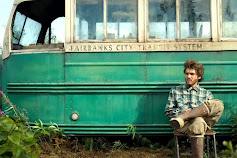
 Original Scene from Into the Wild Original Photo of Me Final Edit Scene Artist Statement The movie I chose was Into the Wild as I have a deep connection with that movie. I watched the movie while in High school after my mother told me that the story reminded her of me. For years I told my mother that I would get a Volkswagen bus and drive with no destination in mind just to see the world. For this piece I had to use many tools, the two most utilized being the masking layer and the brush tool. I masked the entire background of the photo of myself and used the brush tool to help accomplish this and to also add new shadows and highlights. Different affect and adjustment layers were also used such as levels and color balance as well has blending layers life soft and hard light.

PS HW 3

Image
I think the photo above would be difficult to photoshop myself into for a number of reasons. First would be that the background of the mirror is already crowed and disorganized meaning there is limited places that I could be placed. The other difficulty would be the poorer quality and grain of the photo would mean that I would need to take more time to make sure it blends. After seeing the photo above I realized it might be fun to place myself into a family photo, especially a Christmas or thanksgiving one as those are the current holidays coming up. My family also doesn't do any group photos and especially not holiday or photos for a special occasion so it might be fun to work with that theme. I found this photo to be entertaining. I liked how you can still see the feet of the guy so it looks like he's mid fall. There's also something about the position of the girl and how her arms look. She looks very stiff and the way her arms are placed reminds me of a plastic dolls arm

BW to Color

Image
 Original Image Black & White Colored Artist Statement With this project I took an image that I took inspired by Platon's photography after I watched the Abstract documentary about him. I then took this photo and changed it into black and white as most of Platon's photography is black and white. Changing it also gave a consistent base to work with when adding colors on top of it. The three color palettes I chose were Analogous, Square, and Compound. I then used these palettes along with the opacity and masking tools to color and highlight different areas of the photo and create a different feeling for each version.